Blind Deboss vs 5% grey INK
Blind deboss refers to letterpress used without ink. The effect works best when you’re adding texture or for big, bold text. A similar, but more versatile effect is to add 5-7% light grey ink. This still looks like it’s been pressed without ink, but won’t have the issue of being very hard to see in imperfect lighting.
In this video, you’ll see an example of true blind deboss (the lower sheet of paper) and an example of 5% grey ink. I briefly tilt the paper to get the perfect lighting to show off the impression. With the upper (5% grey) sample though, the text remains visible the whole time.
Thicker soft paper will allow for a deeper impression.
NOTE: When it comes time to have your photographer take photos of your design set, please advise them to use lighting from the side to cast shadow in the impression. About 90% of the photos people share with me from their photographers will have completely invisible art (even with 10% grey ink) because they use bright direct lighting.
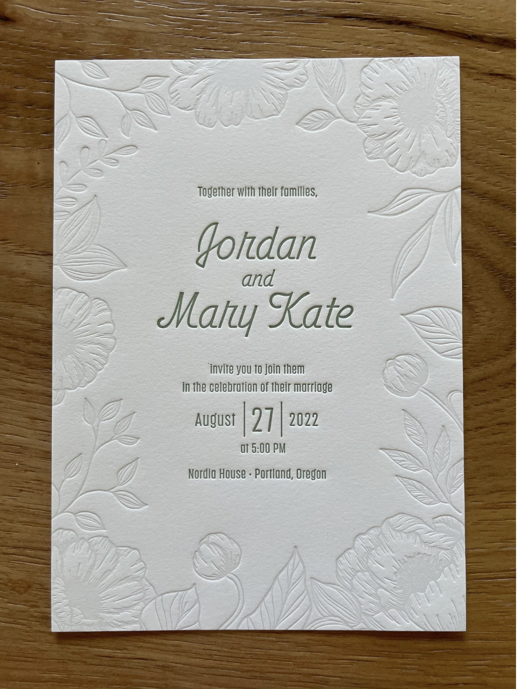
The floral art is this example is 10% grey, pressed on 185lb Pearl White paper.
The upper sample in this video is 5% grey. The lower sample is blind deboss (no ink). Both cost the same. 5%-10% grey is usually recommended.